
With Halloween just around the corner, Apprintable had a little dive into the past Halloween horror movie posters and our team decided on the top 5 Halloween poster designs.
Not just based on intricacy but also the way the design was formed and the thinking behind it, don't get us wrong there was many to choose from but these stood out to us the most. Use them to inspire them for your Halloween parties and we're sure they'll give you some ideas on what horror movie to watch this Halloween as well!

The sixth sense design is genius, a very clear example of less is more, highlighting the 5 senses and then the 6th sense is the kid from The Sixth Sense.
The black is representative of the darkness and then the 6 is very contrasting, it just works. The orange is symbolic of the light, revealing the dead people that Cole can see. The typeface is representative of Amatic SC, a fun playful font, and that pop of white really gets the viewer engaged.
Sometimes it's so easy to look through a poster and ignore elements, but the way this is laid out demands the attention of the viewer at every level, and then finally it's finished off with 'Not every gift is a blessing'. It's always commendable when a designer uses such little to paint such a vivid picture, yet still somehow not giving much away.

With the Halloween movie poster print for Universal Picture's infamous Child's play, we start to get a little technical and intricate, the blood on the film title, the use of left alignment to dominate the right with imagery, it just works for a horror poster. Chuckies eyes at the top, almost to represent the gigantic terror he strikes in everyone's heart as he goes on a killing spree.
Being bigger than the house really paints the picture of the effect that Chuckie brings, the thunder striking the house with the hues of blue set the tone of an eery atmosphere which we know plays a predominant part in the film.
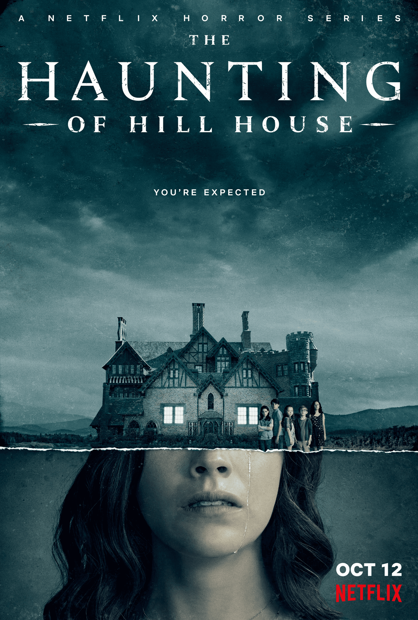
Photo manipulation in a subtle execution is always so appealing, at first we look at the picture and we see that it's two pictures just put together showing the woman and the house, but on closer inspection, you begin to see how the two pictures are merged together.
The movie poster has a commanding title with the striking font of 'Haunting' and then the 'you're expected' is made smaller, it's something you have to read. Now for the explanation of the merge, we see the typical, derelict United States house's windows perfectly positioned to be the woman's eyes, the bottom left and right of the house image is then blended with the hair, to paint the picture of her becoming the possessed by the house.
It's a work of art at the first glance and just gets better the more you analyse it.
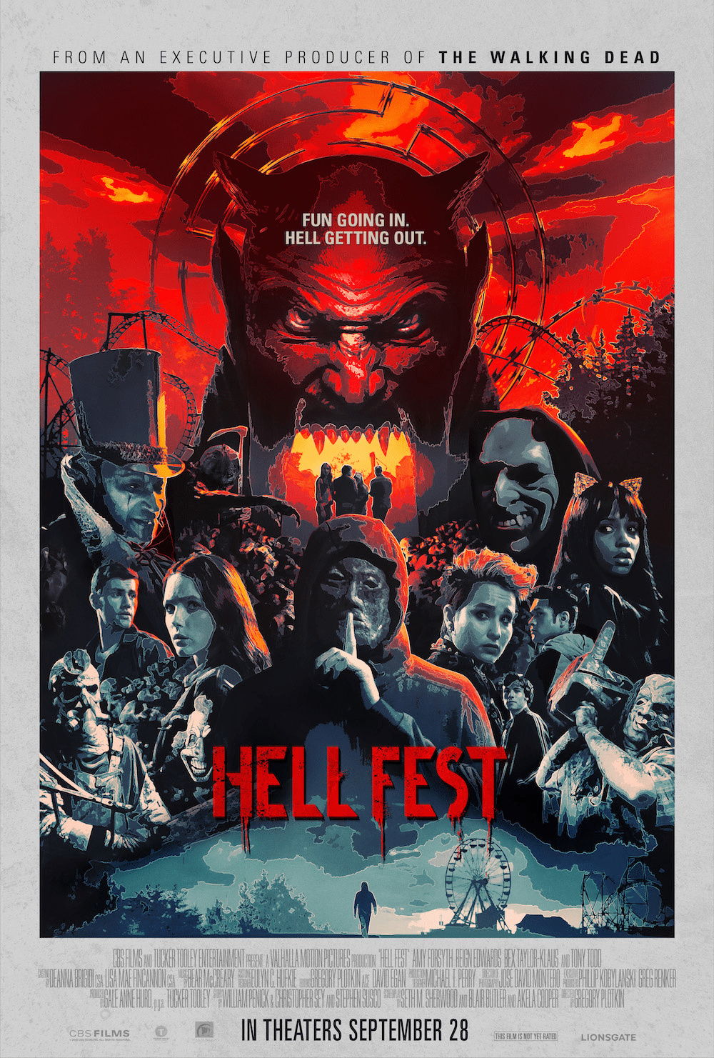
Next up we have Hell Fest, this is a vector illustration at one of its finest, the different stages highlighted as you move up the poster. To start things off they have the outlook, the funfair, with the Ferris wheel and someone walking to it, nothing out of the blue, just very normal, and then the characters get involved. Drawing inspiration from Halloween II, directed by John Carpenter and written by Nick Castle.
Intricate vector illustrations from all angles, some normal and some completely wacky, chainsaws, masks and very odd-looking faces are introduced with hints of red light to symbolise something is definitely above them and there you have it, the devil, powerful and red as ever, mouth full of fire, with what can be made out like a rollercoaster in the background, this was not an easy job, and the levels are done so well.
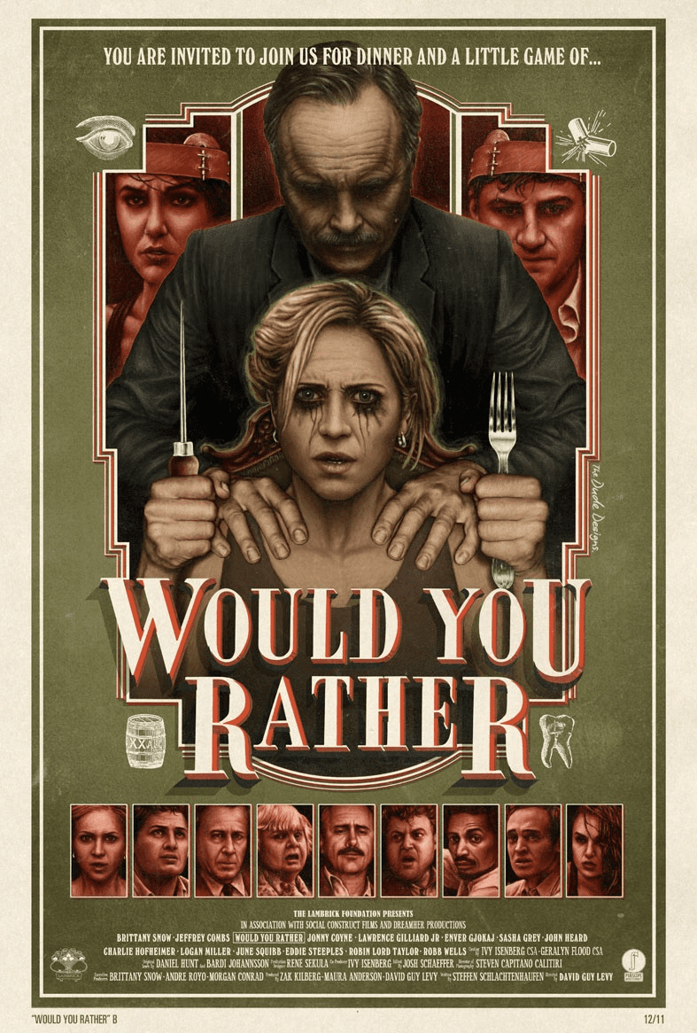
At first glance, it looks more like a board game, which really gets the viewer intrigued, completely illustrated, the poster really paints a picture of how gamification plays an important part in this box office hit, you can see it's not a comedy, the red sits so perfectly on the grimy army green.
Opting to not use white but a very light beige works so well, it almost blends in rather than being so dominating, because there is one focus in this poster and it is the vector illustration. You can see the fear in her eyes as she reprises her role.
The 'Would You Rather' is reminiscent of a very old, dated style, it's not supposed to look beautiful, it's just supposed to sit on top of the image and not take away too much, the execution of this poster is very aesthetically pleasing. When you really analyse the poster and start to notice the mirroring, the way everything sits so well in the centre, available on Blu Ray for you to watch in HD.
• • •
That brings us to the end of this Halloween edition 🎃, with Halloween still fast approaching there's plenty of time to get your movie list up and ready! We hope this top 5 has helped you in picking, of course, we know those movie posters can be very far off from what the movie brings, but it never hurts to start with a great looking poster print does it?!
Of course, there are always the classics as mentioned earlier, like the Halloween saga, including Halloween III Season of The Witch, Halloween The Curse of Michael Myers, Halloween The Curse Returns to Haddonfield and of course the pioneering Halloween featuring Jamie Lee Curtis and the crazy Dr Loomis.

© Apprintable Limited 2026


